Ask most Amazon sellers what's driving their growth, and they'll talk about keywords, PPC bids, and review velocity. Very few will mention brand guidelines. That's exactly why the ones who do have them win.
In a marketplace where shoppers scroll through hundreds of listings and make decisions in under three seconds, the brands that feel familiar — that look the same whether a shopper finds them in search results, on a product page, or in a Sponsored Brand ad — are the ones that get clicked, trusted, and bought. That consistency doesn't happen by accident. It's the result of documented brand guidelines applied across every touchpoint.
What Are Brand Guidelines?
Brand guidelines are a documented framework that defines how your brand looks, sounds, and communicates — across your Amazon listings, A+ Content, Storefront, ads, packaging, and beyond. They cover your visual identity (logo, colors, typography, imagery style), your brand voice (tone, language, messaging), and the rules for how all of these elements are applied consistently.
Think of them as the rulebook that ensures anyone creating content for your brand — whether it's you, a designer, a photographer, or an agency — produces work that feels like it came from the same place.
Why Consistency Is a Competitive Advantage
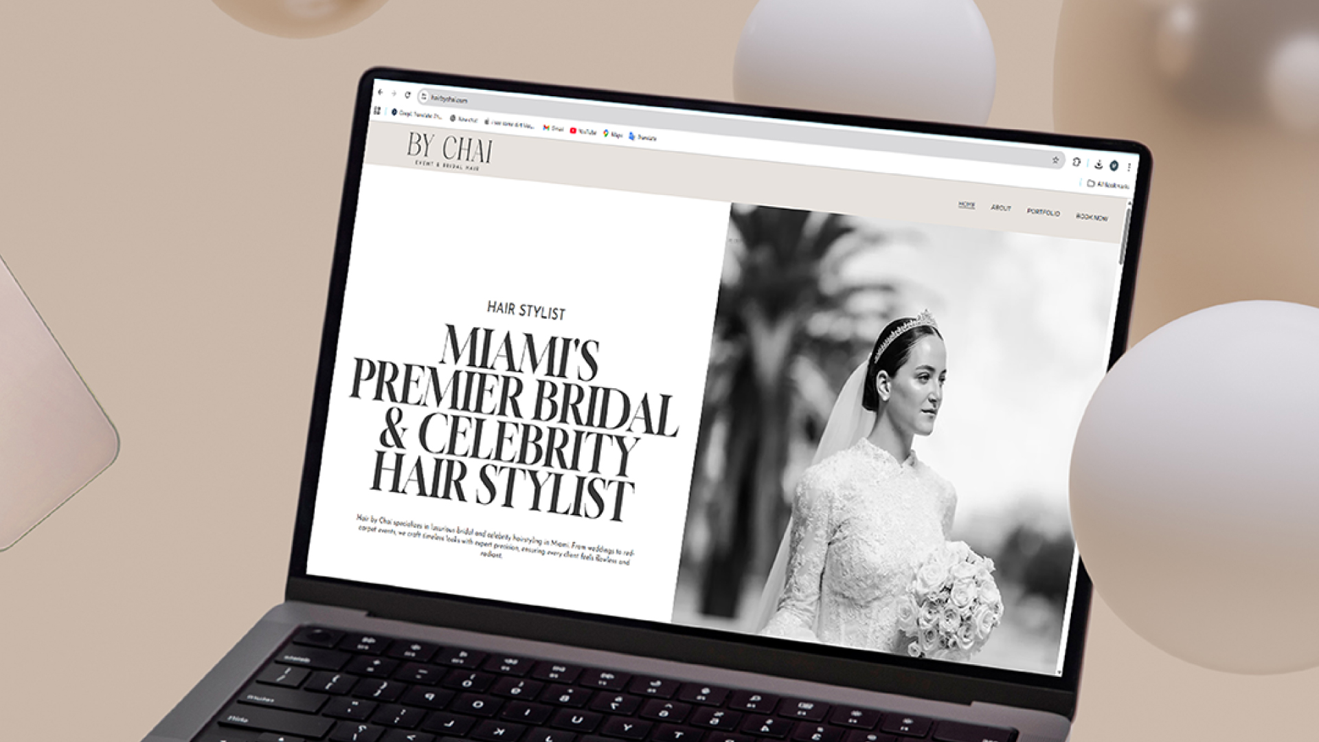
On Amazon, shoppers encounter your brand across multiple surfaces: search result thumbnails, product detail pages, Sponsored Brand banners, A+ Content, your Storefront, and your packaging when the product arrives. Each one of these is an opportunity to reinforce recognition — or introduce doubt.
When every touchpoint looks and sounds consistent, something powerful happens: shoppers start to recognize your brand before they even consciously think about it. That recognition builds trust, and trust drives conversion. Brands with a unified visual identity consistently see higher click-through rates, better conversion rates, and stronger customer retention.
Inconsistency signals to shoppers — even subconsciously — that something is off. Every mismatched font, off-color palette, or tone shift chips away at the credibility you're working to build.
What Your Brand Guidelines Should Include
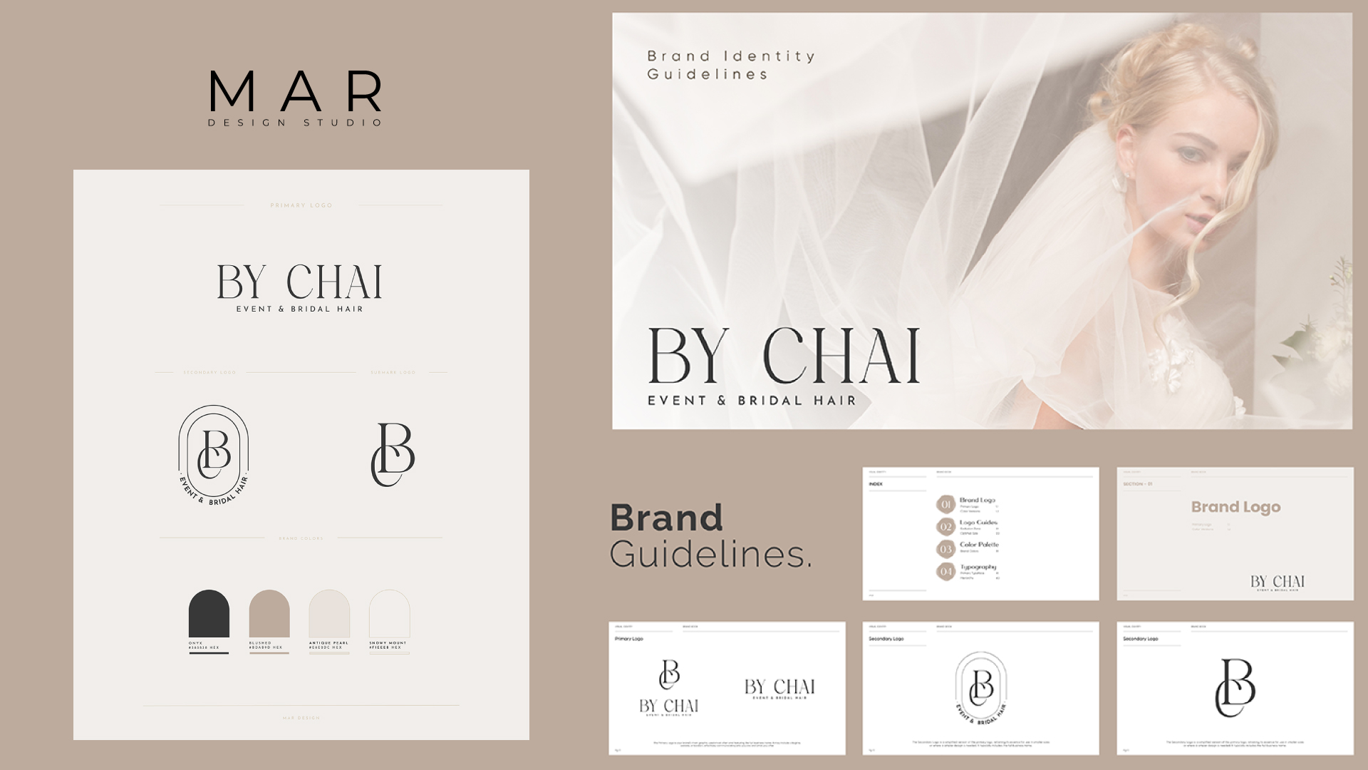
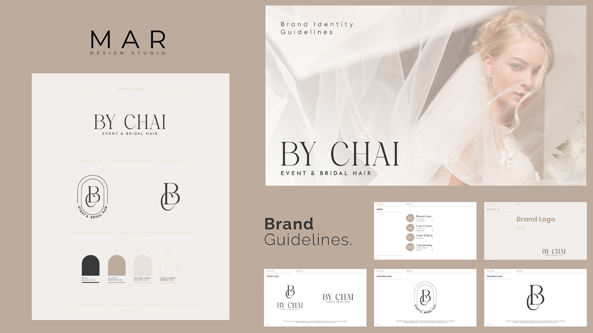
- Logo usage rules Define approved logo versions (full color, single color, reversed), minimum size requirements, required clear space, and prohibited uses. Specify exact color values — hex codes, not approximations — so your logo is always reproduced accurately.
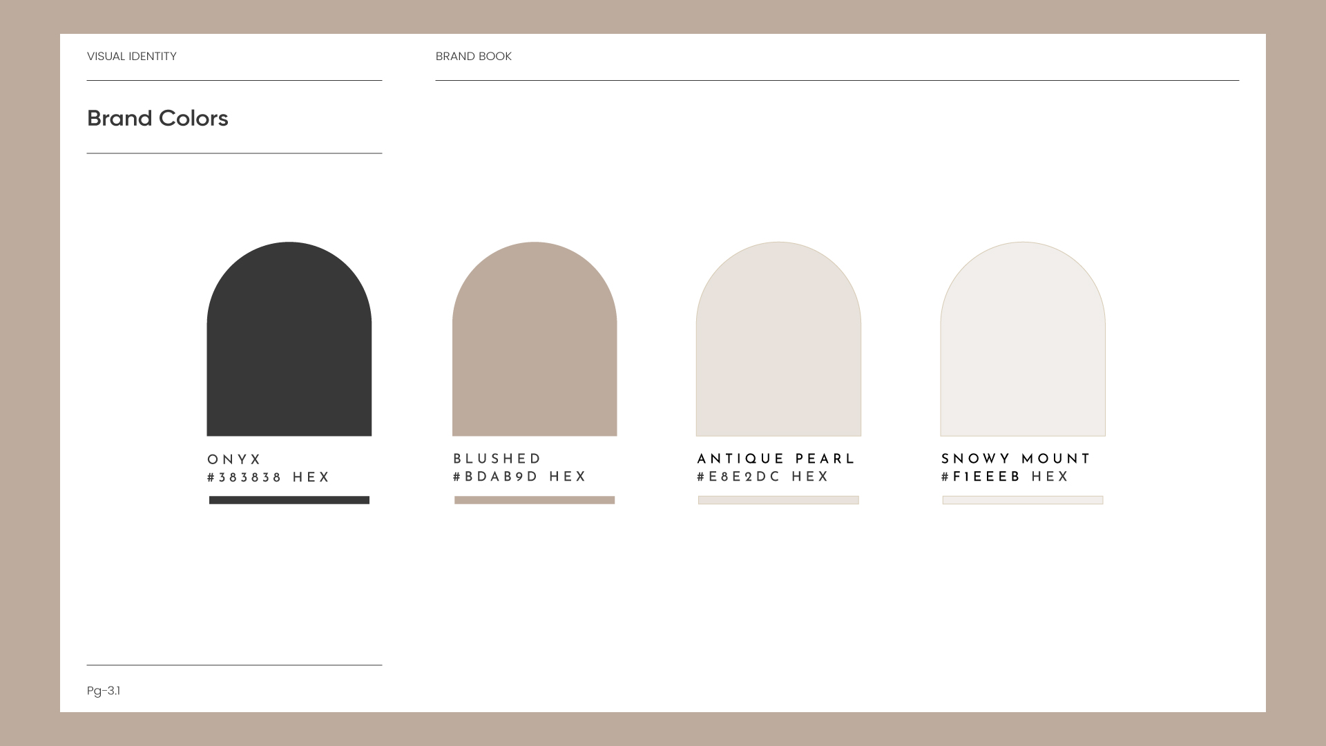
- Color palette Define your primary and secondary colors with precise hex values. Colors communicate emotion and build recognition — they need to be applied consistently across every image, banner, and design asset. A "blushed" tone used in one campaign and a slightly different warm tan in another creates visual noise that erodes brand cohesion.
- Typography Choose a primary font for headlines and a secondary font for body copy. Document point sizes, weights, and usage rules so your visual hierarchy feels coherent whether shoppers are reading your listing title or your A+ module text.
- Imagery style Define what your images should look like: lighting style, preferred angles, background types, and the overall mood of your photography. Include examples of correct and incorrect usage so designers have a visual reference, not just words.
- Brand voice and tone How does your brand communicate? Authoritative and precise? Warm and approachable? Bold and direct? Your tone should be consistent whether it's in your bullet points, your Brand Story, or your Storefront copy. Document this with on-brand and off-brand examples.
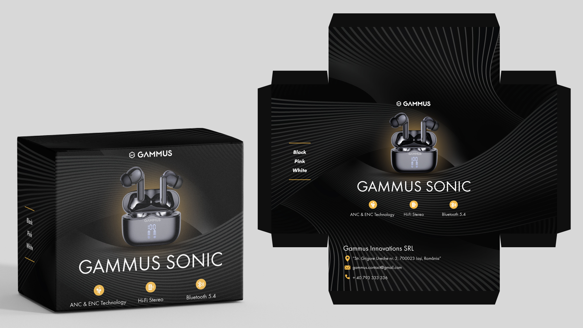
- Amazon-specific application Show how your brand elements apply to listing main images, secondary images, A+ Content modules, Brand Story cards, Storefront tiles, and Sponsored Brand ad creatives. Include mockups so designers know exactly what on-brand looks like in each format.
Rules for Using Amazon's Own Brand Assets
If your marketing references Amazon — on packaging, in ads, or on your website — there are strict rules you must follow. Violations can result in ad disapprovals, Brand Registry action, or loss of access to your enhanced selling tools.
The Bottom Line
Brand guidelines aren't a creative luxury. They're a business system. Every inconsistency in your visual identity is a micro-erosion of the trust you're working to build. Every touchpoint that feels aligned is a deposit into the account of shopper confidence.
Build your guidelines once. Apply them everywhere. Update them as your brand grows. The brands that scale on Amazon aren't the ones with the highest PPC budgets — they're the ones that look like they belong there.