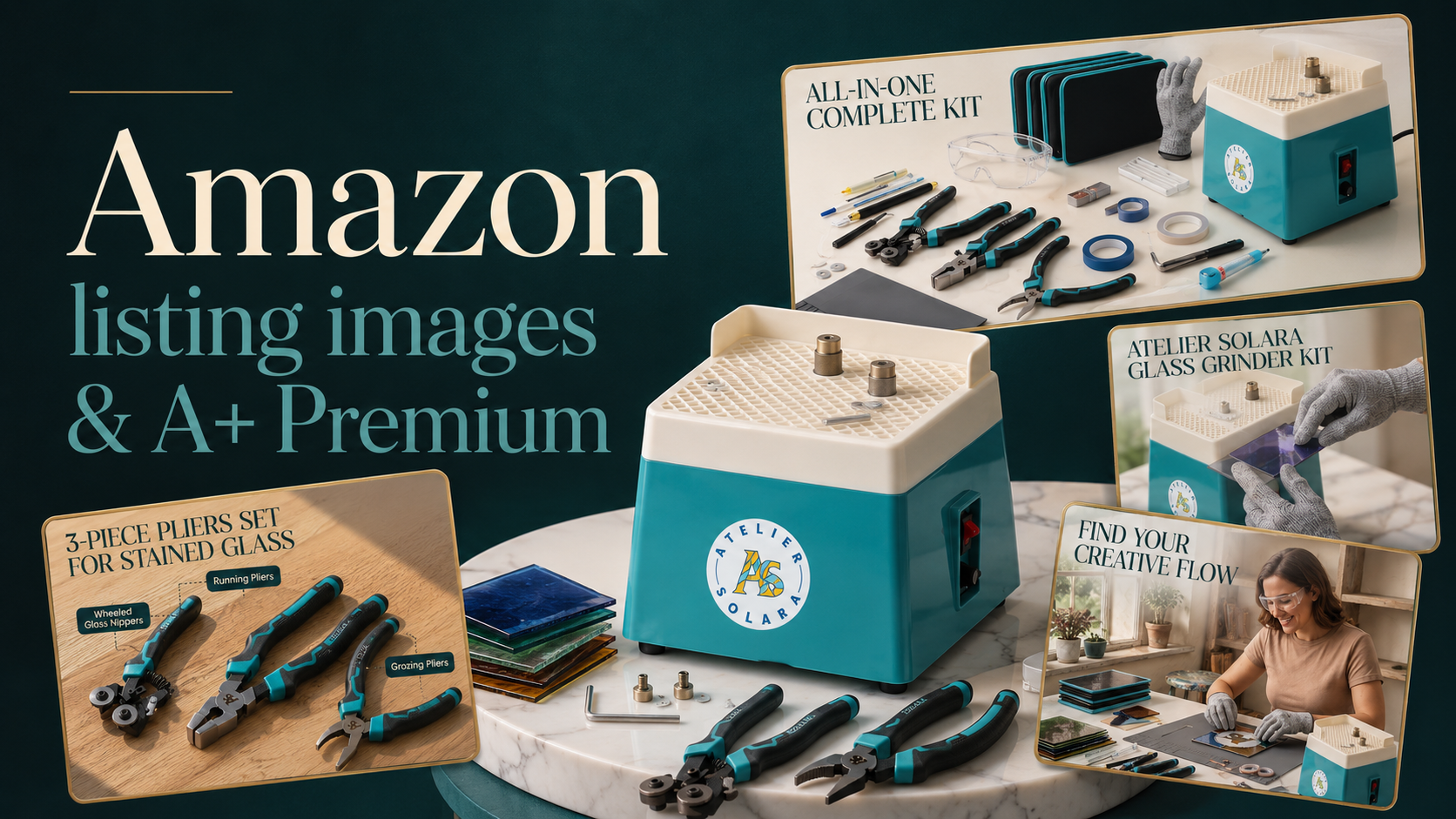
On Amazon, shoppers decide in seconds whether to click "Add to Cart" or move on. A strong product listing — built with the right visuals, structure, and enhanced content — is what makes the difference between getting overlooked and making the sale.
This guide covers the two pillars of a high-performing Amazon listing: the core listing design that earns clicks, and A+ Premium Content that turns browsers into buyers.
Your First Impression
An Amazon listing is how you present your product to the world: the images, copy, and layout that help customers instantly understand what you're selling and why they should choose you. A well-designed listing builds trust, improves rankings, and drives more conversions.
What Makes a Great Listing?
- Main Image Your main image is what shoppers see first in search results. It must have a clean white background (Amazon requirement), show the product clearly, and be high-resolution. It's your most important asset — make it count.
- Product Images Use 2–3 shots showing different angles, packaging, and key details. Close-ups and scale references help customers understand size, texture, and quality — reducing returns before they happen.
- Lifestyle Images Show your product in real-life settings. Lifestyle shots help customers picture the item in their own life and create an emotional connection. Aim for 2–3 photos covering different use cases.
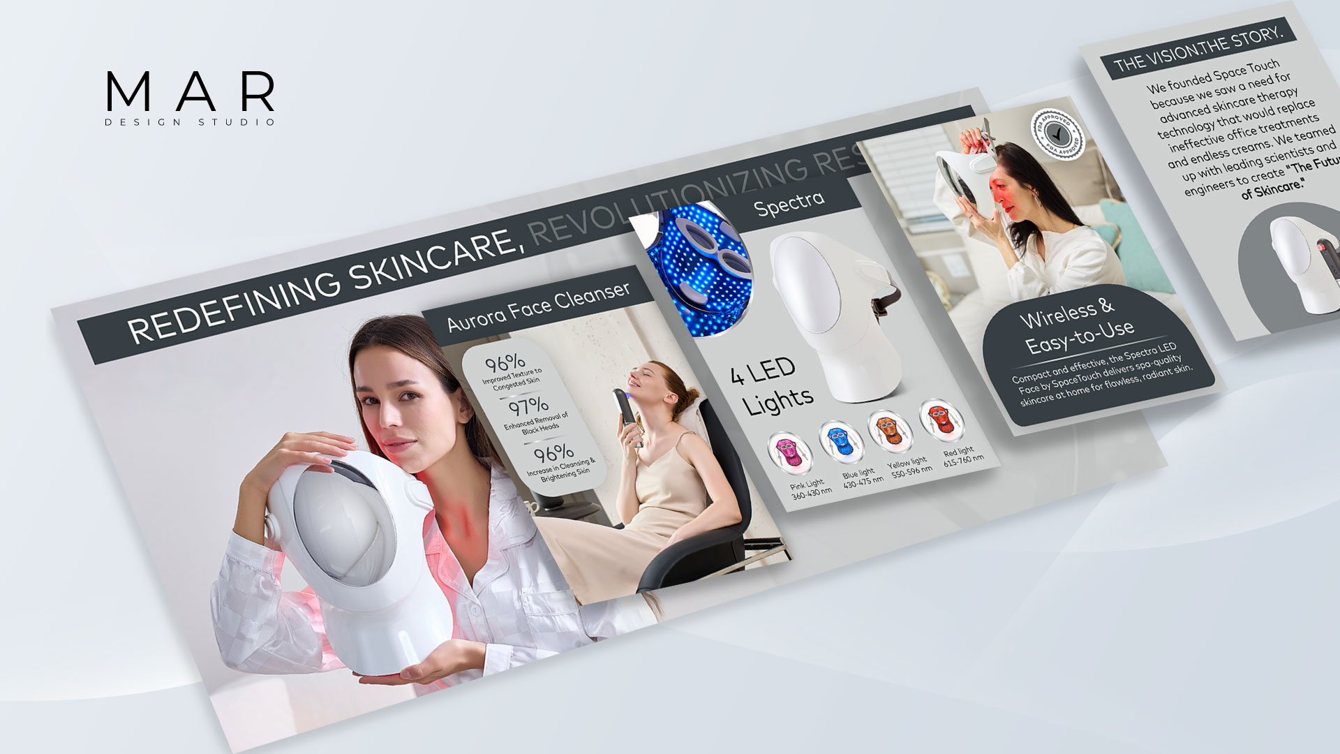
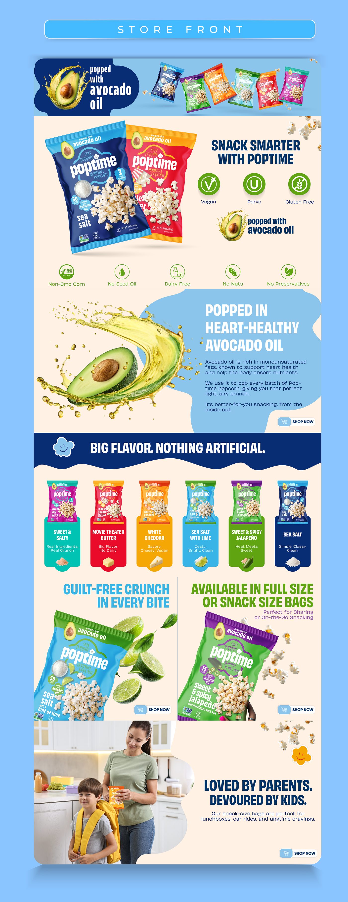
- Infographics Visually explain features and benefits using icons, short text, and clean layouts. Two to three well-designed infographics can answer key questions at a glance — before a shopper reads a single bullet point.
- Comparison Charts Help shoppers make confident decisions by showing how your product compares to alternatives. A clear comparison chart builds credibility and positions you as the smarter choice.
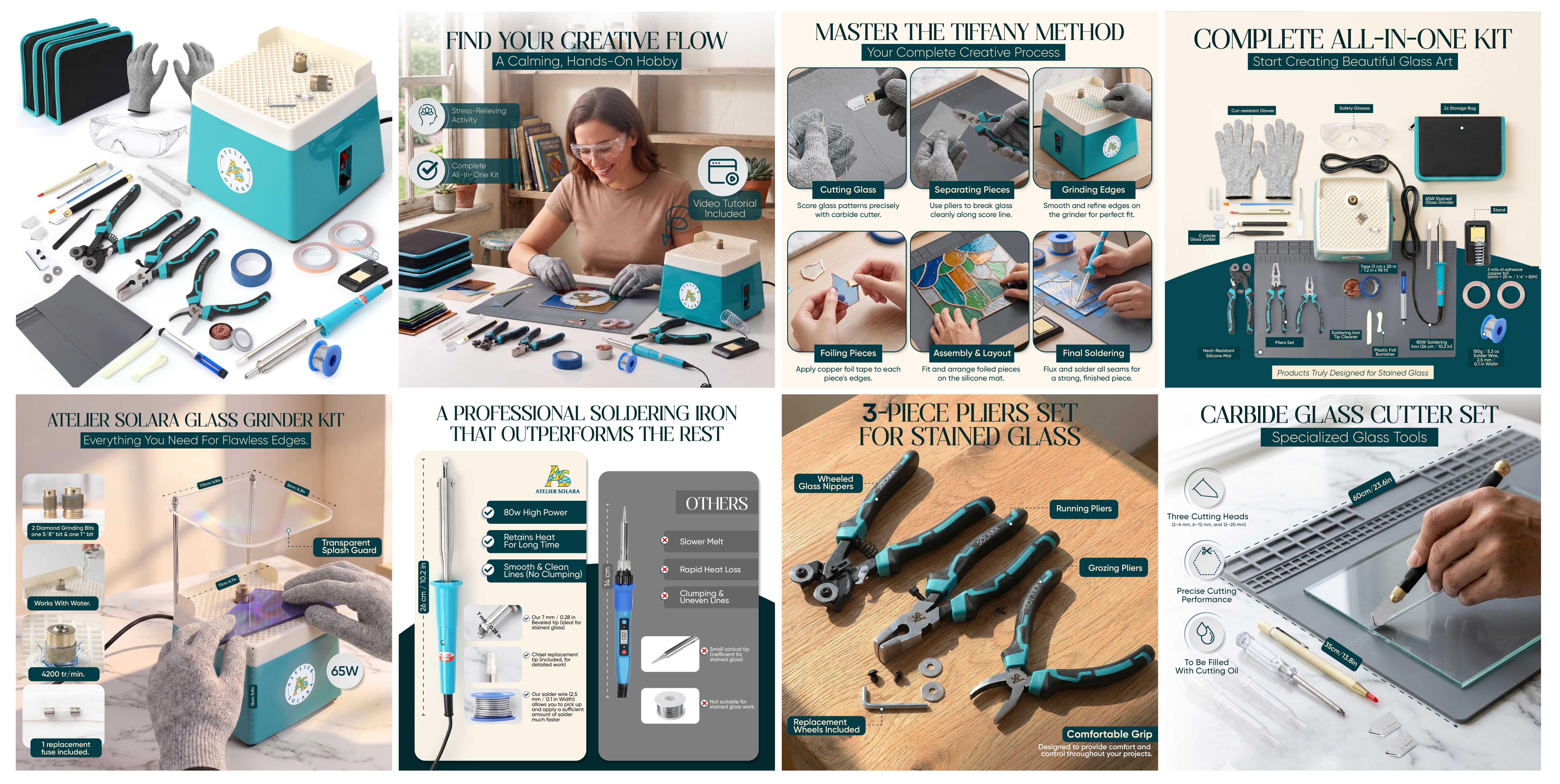
A great listing design doesn't just showcase your product — it tells a story, answers questions before they're asked, and moves shoppers closer to purchase.
How to Build A+ Content That Actually Converts
A+ Premium is only as powerful as the content inside it. The modules, visuals, and copy you place there determine whether a shopper who lands on your page becomes a buyer — or bounces. Here's a practical framework for building modules that work.
- Start strong Open with your logo, product name, and a clear hero shot. This sets the tone and establishes brand trust immediately. Shoppers decide whether to keep scrolling in the first module.
- Show versatility Highlight different use cases. The more ways a product can be used, the stronger its appeal — and the broader the audience it speaks to.
- Keep text short and scannable Shoppers don't read long paragraphs. Aim for 80% images, 20% text, with short captions that explain each feature clearly. If a module requires a wall of text to make sense, redesign the module.
- Use lifestyle images Show the product in real environments so shoppers can picture it in their own life. Lifestyle images in A+ are not decorative — they're the closest thing to a product demo you can offer on the page.
- Spotlight what makes you unique Give standout features their own module. Whether it's country of origin, years on the market, or a unique innovation — tell that story. Generic A+ content looks like every competitor's page.
- Optimize for mobile Over 70% of Amazon shoppers browse on mobile in 2026. Avoid small text inside images, use bold simple compositions, and always preview on a phone before submitting. What looks clean on desktop often becomes unreadable on a 6-inch screen.

The Bottom Line
A strong Amazon listing and A+ Premium content aren't separate strategies — they work together. Your listing design earns the click; your A+ content closes the sale.
By combining clean visuals, clear benefits, and interactive modules, you turn your product page from a simple showcase into a powerful, trust-building sales tool.